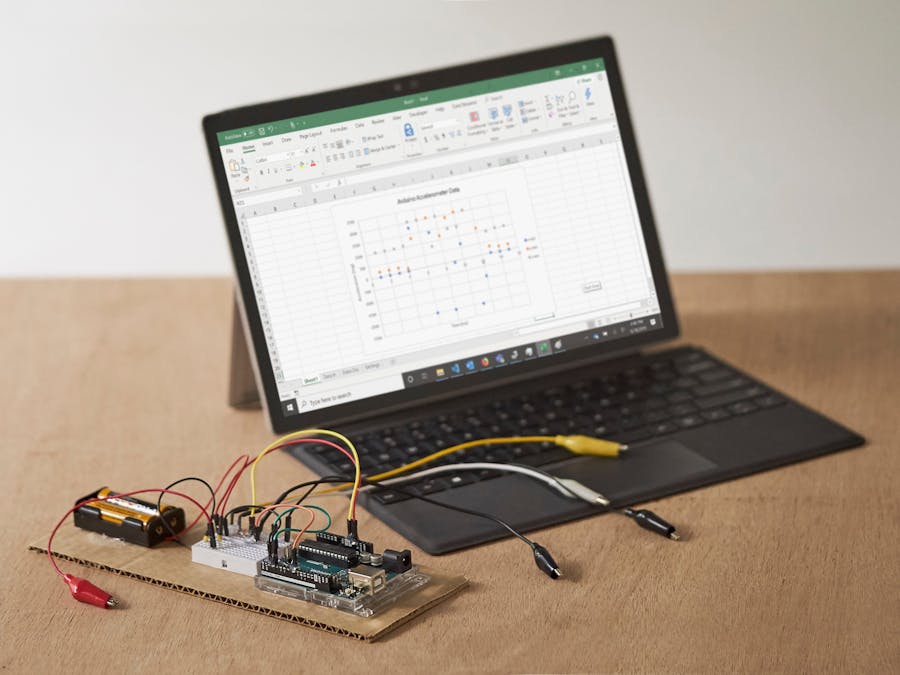
Microsoft Excel is a helpful tool to visualize and analyze data. The Data Streamer add-in allows you to import, view, and analyze live data from external devices like your Arduino microcontroller. This makes gathering data from sensors accessible, affordable, and user-friendly for a wide variety of applications.
Data Streamer, free w/ O365, reads values printed to your computer's serial port, which is the same method data is printed to the Arduino IDE Serial Monitor.
For this tutorial, you'll need to have Microsoft Excel O365 with Data Streamer enabled. For instructions on how to do this, visit the Data Streamer website.
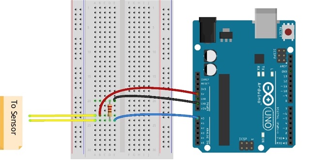
Let's get started!1. Connect your sensor to the Arduino microcontroller.
Use your own sensor or follow one of our tutorials. Here are some examples: Electroconductivity Sensor, Pressure Sensor, Electromagnetic Sensor.
2. Write and flash a sketch that reads in the sensor and prints the value to the Serial Monitor with a new line at the end.
Write your own or use the sample code in the attachments section.
Note: if you use the sample code, be sure to connect your sensor to Arduino Analog Pin A0.
3. Open Excel and navigate to the Data Streamer tab. Click Connect a Device to connect Excel to the microcontroller.
This will create 3 new sheets:
- Data In: Live data is printed on this sheet.
- Data Out: Send data and/or commands to the Arduino board using this sheet.
- Settings: Change basic settings for Data Streamer, including the amount of live data and number of data columns.
4. Click Start Data to begin streaming data into Excel.
By default we only get 15 rows of data, but you can gather up to 500 rows of live data (limit is due to Excel bandwidth -- there's a lot happening in the background!).
5. To save data into a text (.CSV) file, click the Record Data button.
When you click Stop Record, you will be prompted to select a file name and location.
6. Add a Plot of your data! Do some data analysis!
Scatter plots show you how the sensor readings change over time. Add a Scatter Plot by going to Insert -> Charts -> Scatter.
When the plot pops up, right click on the empty chart and choose "Select Data," then Add a Series.
Add a title to your data series. Next, you'll want to display your data on the y-axis, with "time"* on the x-axis. To do this, click the arrow under the "Series Y-Values."
Go to the Data In sheet, and select all of the incoming sensor data.
Now you have a plot of your live data! This makes it much easier to visualize and understand changes in the sensor readings.
Youcan also do calculations and comparisons in Excel! To write a formula, click on an empty cell and type an equals sign ("="), then the calculation you want to do. There are lots of built-in commands like average, maximum, and minimum.
To use a command, type the equals ("=") sign, the command name, and an open parenthesis, then select the data you're analyzing and close the parentheses.
*If you want the actual time to be on the x-axis, select the timestamp in Column A on the Data In sheet for the x-axis values in your Scatter Plot. Either way, we'll see our data as it changes over time.
7. To send more than one column of data (AKA more than one sensor), print the values on the same line separated by a comma, with a final blank new line, like this:
Serial.print(sensorReading1);
Serial.print(",");
Serial.print(sensorReading2);
Serial.print(",");
Serial.println();
That's it! Go forth and measure all the things!
Use this as a foundation to start exploring sensors, Arduino coding, and data analysis to tackle your questions, curiosities, and fav mysteries in this big, beautiful world.
Visit the Data Streamer website for instructions for simple sensor projects, or check out the Microsoft Hacking STEM website for more project ideas and full curriculum!
And of course, please leave a comment if you have any questions or need any assistance!
Happy making!


_ztBMuBhMHo.jpg?auto=compress%2Cformat&w=48&h=48&fit=fill&bg=ffffff)


Comments
Please log in or sign up to comment.