The Intro:
This project is split up into two very related parts: Watch and Mobile. I will go into the design aspects of each after a quick summary. This app allows a user to detect earthquakes in real time and pull up pictures from Twitter through a simple shake of his or her watch.
The Watch
The "Start" Screen is a very simple layout utilizing a highly contrasting color scheme of brown and yellow that is easy to read. This color scheme is consistent throughout the app and feels right for an Earthquake Application. When a user starts up the app, earthquake notifications will begin to pop up on the watch as they occur.
The "Notification" Screen occurs when there is a new earthquake. The watch will first vibrate and then the user can see the location of the earthquake and how far away that is from the current location.
The "Details" Screen is reached by swiping right on the notification screen and tapping on the open button. A helpful tip in the same yellow color appears on the screen telling the user to shake his or her watch for images. Users can also click on the "x" to close the app and return the mobile phone back to its "List" Screen. Once the user shakes, the phone will display an image from Twitter and the watch will display a short description of the image.
The Phone
For the sake of demonstration, STRONG earthquakes are above a 2.0 magnitude, MODERATION earthquakes are above a 1.0 magnitude, and WEAK earthquakes are below a 1.0 magnitude.
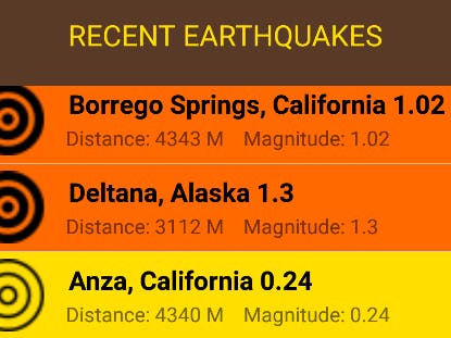
The "List" Screen begins by checking to see if GPS is enabled on the device. If it is, it will then pull out the 10 most recent Earthquakes. As long as the user allows the app to run, this list will continue to grow with new earthquakes. However, if the user turns off the phone or terminates the app, the list will restart and display the 10 most recent earthquakes. I made a design decision that users do not want to have a huge list of earthquakes over a long duration of time that will suck up memory. This list has the location of the earthquake, its magnitude, and its distance away from the user. The item will also be red if the earthquake is strong, orange if it is moderate, and yellow if it is weak. There is also a handy icon next the location of the earthquake which will intensify in boldness which increasing magnitude strength.
The "Map" Screen is reached via a new earthquake or a click on one of the list items. The screen displays the location, the distance, and the magnitude of the earthquake in the same brown and yellow color scheme. The marker is small for weak earthquakes, medium for moderate, and large for string earthquakes. Users can also interact with the map by zooming in/out and moving on the map via drag.
The "Image" Screen is created when a user shakes the watch above a certain threshold. Accidental shakes will not change the image while the user is trying to look at it. While the image screen is up, the user will receive a description of the image on the watch.


Comments