Ideation
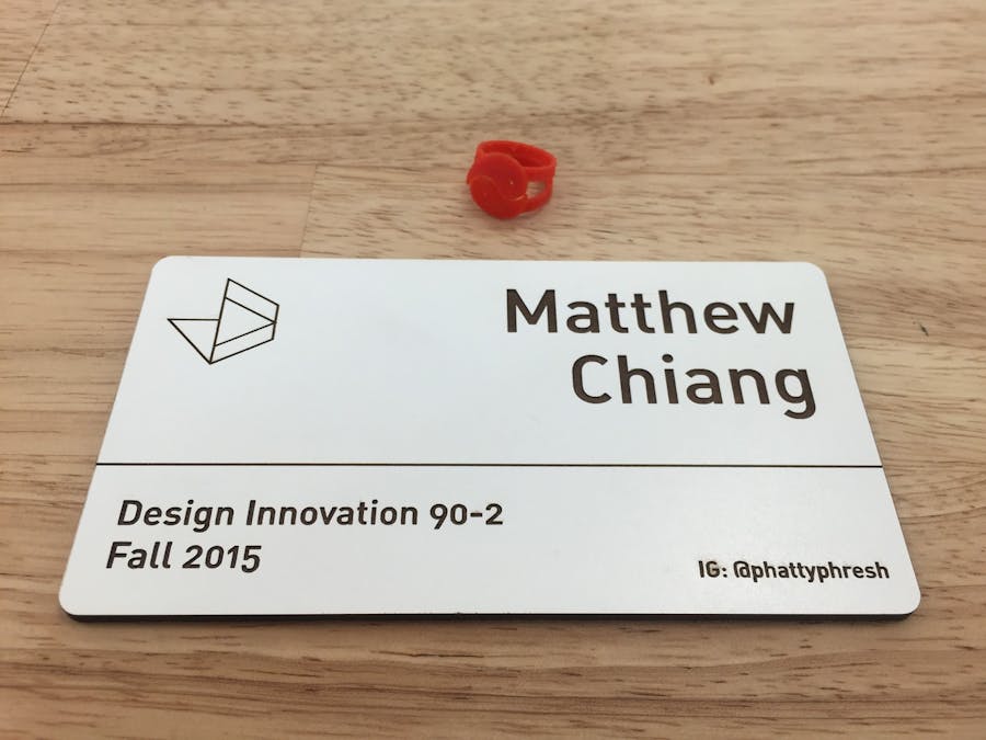
The concept of "business cards" came to mind for my name tag. I wanted it to look very clean and give off a professional, yet personable impression.
The logo at the top left is the Jacobs Institute logo. I created a vector out of an image copy I pulled from the web. The font used is Din. Typography principles came into play for readability and information organization purposes. Different types of information like my name, the class and semester, and my Instagram are organized together accordingly and spaced apart from each other.
Result
I laser cut my design on white econo wood and it came out smokey, but with a wet paper towel, it cleaned easily.
Future Considerations
I think I should've put my personal website on the bottom right corner instead of my Instagram because my website showcases more of my relevant and best work. On the other hand, if you're considering on using this design and have a great Instagram showing your photography skills or things you've worked on, then leaving it on the name tag is perfectly fine.
Also, I intentionally made my name tag flat in order to stay minimal and not detract from whatever work is being shown alongside it. Creating a stand for it, however, could possibly improve readability if the work is shown on a flat surface. A built-in stand mechanism on the back of the tag would make it versatile.


Comments