Ironically, Hackster has a terrible interface so linked here is the story from interview to brainstorm:
(For easiest reading, view as is, and not in presentation mode.)
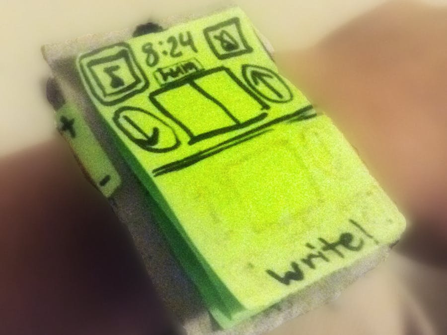
From my chosen favorite app idea of a music tuner/metronome, I wanted to emphazie the simplicity of the design with the fact that it really doesn't matter what shape the watch is. The interface can and should be simple enough to work on any shape touch screen!
Prototyping:
After completing my watch I decided to test it out on a user.
User Testing: Feedback and Revision
In short, with no instructions, the tuner/metronome app was very intuitive to use. Two icons in the top corner indicated a switch between tuner and metronome mode, and the user correctly expected the "down" and "up" arrows on the screen to slow/quicken the tempo and lower/raise a pitch on the respective modes because there was a classic volume control on the side of the watch to eliminate any ambiguious meanings for the two directional symbols.
However, in my desire to present multiple input options for the user, the flexibility ended up becoming a hindrance. While I would have like to use the inspired idea of having users handwrite input, in terms of musical notation, the user responded that she prefered slider options to select exactly what she wanted because it was unclear to her what the result of what she wrote would be and that there was too many possible recognition errors since there were so many constraints on valid symbols. Additionally, users should not need to switch between two input modes (i.e. get rid of the hum and tap buttons squeezed on the screen, and instead users should just be able to do either seaminglessly) and if a feature is not visibly available, it can be explained in the manual (a system image if you will).
I also did not extend my imagination enough before doing a test run: I had envisioned the tuner would try to best match the last pitch it had heard, but ran into issues of what would happen if you held the decrementing button while holding the pitch you were decrementing. So there were definitely logistics I need to be conscious of when using audio input like making sure the input was desired and purposeful.
Most foolishly, I did not include a way to stop or start a pitch or beat, and from the feedback I recieved I have revised my interface to the following:
In my revisions, I added a play/stop button, removed the up/down arrow functions as a sliding pitch and tempo selector made the directional buttons redundant. I also added a hold/record button and a tap button that could be held/selected to allow users to only pass in off-screen input when they wanted to. There is still much work to be done but all, I was satisfied enough with my changes to ask for a second look.
And indeed, the revised interface was given two thumbs-up because both hands were free! :)


Comments