The Interviews
I interviewed four different people, busy white collar professionals, to see what their mobile phone experience was.
1. Caitlin is a 22 year old publishing assistant. Recently, she was in the kitchen cooking and wanted to look at her phone to see the recipe and answer a text message, but her hands were dirty. She normally keeps her phone in her purse when she's on the go but otherwise keeps it close to her body.
2. Melissa is a 21 year old library assistant. She was walking around in the library and wanted to reach her phone to go through Tumblr, but her hands were occupied with books. Normally, she keeps her phone in her pocket.
3. Nick is a 25 year old real estate manager and wanted to look at football stats on the BART on his long commute from Berkeley to San Francisco. His phone was in his pocket, but he was unable to reach it because he was holding a briefcase and clinging onto the BART pole.
4. Harrison is a 50 year old data scientist/librarian. He was riding his bike home and got a call. He wanted to see who it was to determine whether the call was important and wanted to be able to answer or reject the call. If it wasn't someone important, he wanted to be able to send a short pre-programmed text response to them.
Brainstorm
These are the ideas Alana Tran( peer in CS160) and I came up with:
1. Cooking - an app for people to see recipes and do quick measurement conversions with voice. Includes a timer for baking and other needs and reminds the user with a vibration to go back to the kitchen and check on the food.
2. Texting - an app to easily text someone by writing letters onto the watch face.
3, Networking - see aggregated social media information from LinkedIn, Facebook, Twitter, and other forms of social media about the person you're talking to.
4. Depression Tracker - an app for depressed people that tracks the user's heart rate and remind them to take their medication
5. Calendar app - syncs with calendar programs such as Google Calendar and reminds you of upcoming events. If the event has a location, it tells you when you need to leave to get from your current location to the destination and includes directions.
6. Task organizer - an app for productive people to write down tasks into this app and never forget those tasks because this app will push constant reminders to the watch.
7. Directions - an app for people who want discreet directions. Input start and end destinations and see directions with different vibrations to indicate a right or left turn.
8.Ping- an app for workplace professionals to keep track of colleagues on large work campuses and ping them to request their presence
9. Email app - dictate short emails by tapping on the screen and view emails using the Spritz technique.
10. Biking - an app for bikers to see recommended biking routes by other avid bicyclists and track their workouts.
11.Alarm - an app to wake up gently with vibrations on the wrist
12. Apply for jobs - an app for job seekers to quickly swipe right or left on a company to send their resume
13.Translate - take pictures with the watch and find out what the object is
Prototyping
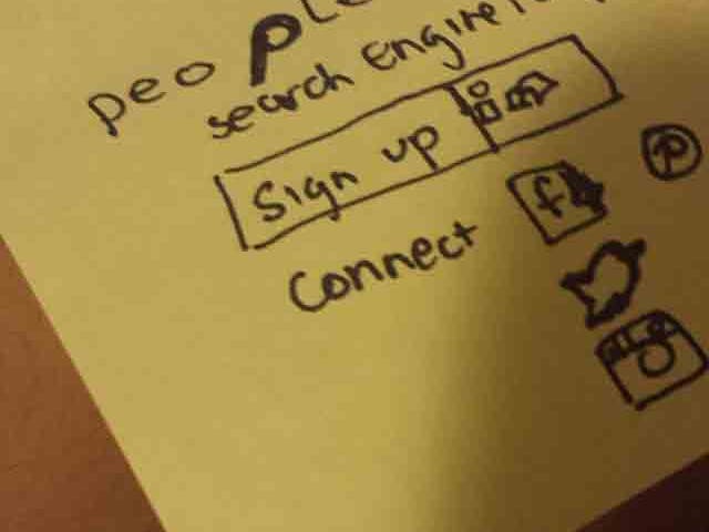
I picked (3) the Networking app because this app would be useful for me since I am trying to find a job and build my network. It aggregates information across fragmented social networks. My target audience is professional white collar workers.
I named the app people with the second p as a magnifying glass to signify that it is a search engine. The first screen allows you to sign up and select which networks you want to connect to. Then, you type in the name of the person and the company(if you know it). You then see a list of results with LinkedIn profile pictures and what their most recent job was. Tapping on one of the results will bring you to a more detailed view of the person. You can see details about their previous work history and Facebook and Twitter data. Flicking up/scrolling down the page allows you to input private notes about your interaction with the person.
User Testing
I tested my prototype with a 20 year old female who is trying to build her network on LinkedIn. Her feedback was
1. Too much info - There's too much information being displayed on the small screen.
2. Privacy issues - She doesn't want people to see that she's looking them up on her watch.
3. Liked the notes section to record information about the conversation if she was talking to a recruiter. Could be handy for when she drafts her cover letter for the company.
4.Liked the idea of the app- She could see herself using the app because it's useful information.
5.Suggested feature - It would be cool to rate social interactions with people, like on Yelp where it is nice,funny, or so on. Then you could get a better vibe about the person.
6.Move the done modal box that pops up when you add people to your network to the middle of the screen.
7. Put enter button on the search page
8. Better catchphrase that's less redundant
9. Liked the different sections Yelp,Twitter, FB and how it was clearly delineated.
10. Very creative with the Starbucks watch strap and post-it watch face.
Her feedback was very valuable. In regards to (1), we could try implementing an algorithm to deliver a short summary of the person, rather than display the original content from each social media stream. The suggested feature(5) was a great idea, but I'm worried that the feature would be abused to cyberbully people.


Comments