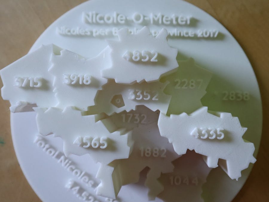
On the website of the Belgian government, you can find interesting data about the first names of the population. Let's use this data to make a cool data visualisation!
Data CleaningFirst, we need to clean the data so only the useful bits, the numbers we want to show, remain.
After attempting to make a Python script to do this, which took forever to filter the data, I ended up doing it manually using the sort & filter functions in Excel. I alphabetically sorted the data by name, and singled out all the Nicoles. After this, I sorted by ZIP code and summarised the number of Nicoles per province.
Now we have our numbers, we need to make it look pretty on a map!
I used this low-poly map of Belgium to create a nice-looking 2D map in Illustrator.
Once the 2D map was imported in Fusion360, I adjusted the heights of the provinces to match the amount of Nicoles living in that province.
For instance, there are 4832 Nicoles living in the province of Antwerp, so the height of the province is 48mm.
3D PrintingLast but not least, it's time to 3D print the map. I ended up printing a number of different versions, and as it's a long print, it's best to start with a smaller version in draft printer settings (learned that the hard way...).
And there we have it, a cool, personalised 3D map!


Comments
Please log in or sign up to comment.