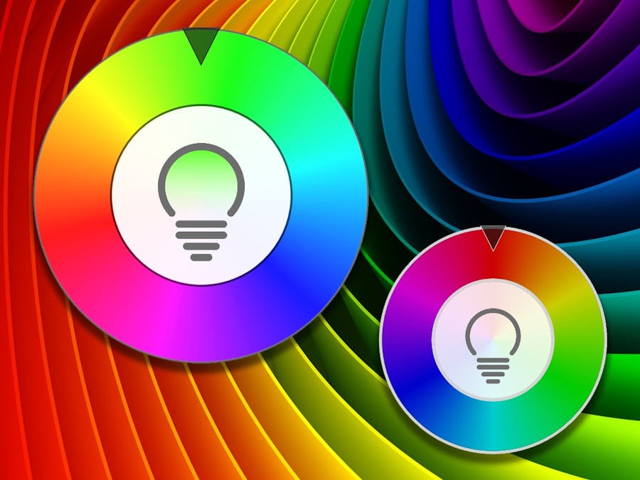
I recently built a UWP UI control for controlling an RGB LED. I was looking for something that was easy to select a color visually and was touch enabled.
FeaturesThe control has these features:
- Full hue based rotation
- Supports inertia
- Scalable
- Content based control (place other controls in the center)
- Selectable color
- HSB color based
- Provides conversion to RGB
- Works on Windows 10 IoT Core (tested on Raspberry Pi 3)
The following video is a demonstration of the control on Windows 10.
The source code for the application demonstrated in the video above can be found in the GitHub repository linked at the bottom of this project.
Adding the control to your code is easy. The will control support binding on the properties. The selected color can be retrieved in an event as shown below.
<colorpicker:ColorPickerWheel x:Name="ColorPicker"
        IsEnabled="True"
        VerticalAlignment="Center"
        HorizontalAlignment="Center"
	BorderThickness="3"
	InnerDiameter=".55"
	Hue="0"
	Brightness="1.0"
	Saturation="1.0"
	BorderBrush="#99000000"
	IndicatorOffset="0"
	Background="#F2FFFFFF"
	IndicatorBackground="{ThemeResource ButtonBackground}"
	SelectedColorChanged="ColorPicker_SelectedColorChanged">
	<colorpicker:ColorPickerWheel.Content>
</<colorpicker:ColorPickerWheel>
The control also includes a light bulb based toggle switch that can be added as shown below.
<colorpicker:ColorPickerWheel x:Name="ColorPicker"
	IsEnabled="True"
	VerticalAlignment="Center"
	HorizontalAlignment="Center"
	BorderThickness="3"
	InnerDiameter=".55"
	Hue="0"
	Brightness="1.0"
	Saturation="1.0"
	BorderBrush="#99000000"
	IndicatorOffset="0"
	Background="#F2FFFFFF"
	IndicatorBackground="{ThemeResource ButtonBackground}"
	SelectedColorChanged="ColorPicker_SelectedColorChanged">
<colorpicker:ColorPickerWheel.Content>
<colorpicker:TogglePowerSwitch x:Name="PowerSwitch"
	Foreground="#FF6E6E6E"
	HorizontalAlignment="Center"
	VerticalAlignment="Center"
	Width="{Binding ElementName=ColorPicker, Path=ActualInnerDiameter}"
	Height="{Binding ElementName=ColorPicker, Path=ActualInnerDiameter}"
	Hue="{Binding ElementName=ColorPicker, Path=Hue}"
	Saturation="{Binding ElementName=ColorPicker, Path=Saturation}"
	Brightness="{Binding ElementName=ColorPicker, Path=Brightness}" />
</colorpicker:ColorPickerWheel.Content>
</colorpicker:ColorPickerWheel>
The control can support any type of control in the content area. In addition, the control supports a disabled state as shown here.
The video below demonstrates the control in an application for controlling LIFX Wi-Fi bulbs.
The source code for the application demonstrated in the video above can be found in the GitHub repository linked at the bottom of this project.
Using the ControlTo use the control either add the source code (found in the GitHub repository linked at the bottom of this project) to your project or get it from NuGet.
Installing the control from the NuGet package manager console can be done by executing the command shown below.
pm> install-package Porrey.Controls.ColorPicker


Comments
Please log in or sign up to comment.